
 |
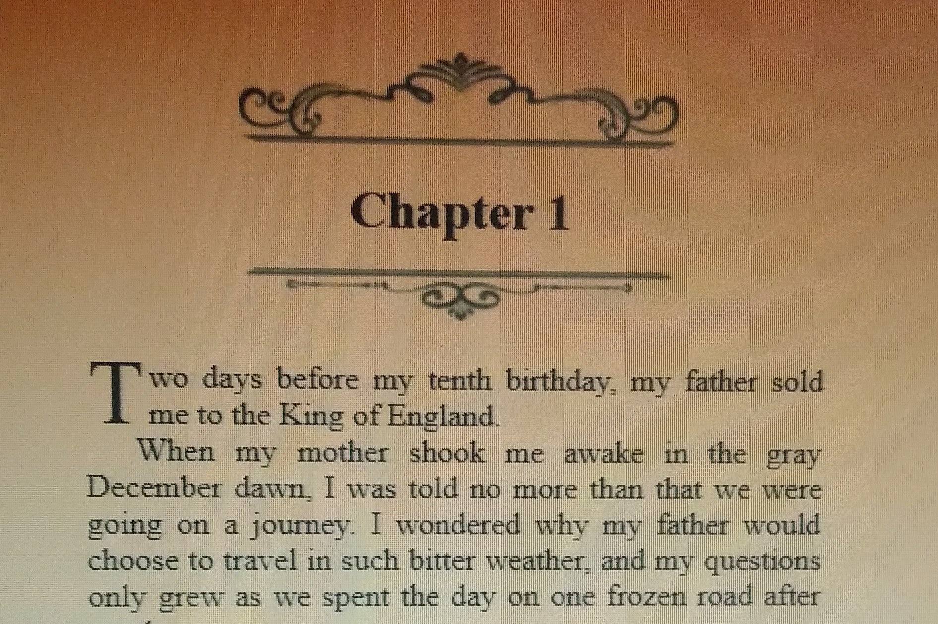
| Maraschino style |
I started with ebook publishing, because there is less structure there, and different expectations. Everyone knows what a paper book is supposed to look like, and that is what I need to learn to format. But ebook publishing starts with learning how to properly format your Word or Google doc with headings and styles, because the programs that assist with ebook formatting take those styles into account and you don't have to do things like build tables of contents from scratch.
I'm using Draft2Digital for my ebook formatting, and for the bulk of my ebook distribution. D2D provides formatting services free of charge, and you can simply download your ebook (epub, mobi and PDF formats) without going any further with them, or you can continue on to their distribution channels. I'll go over distribution in a separate post, but for now I'll say that D2D will be doing distribution in specific areas only. They take a percentage of royalties for any sales made through their channels, but again, the formatting tools are completely free.
There are other ways to format, but I chose D2D because it was free, intuitive (and I'm not tech savvy) and there were a lot of built-in styles that I liked the look of (styles are things like drop caps, headers, scene separators, etc). You upload your finished manuscript and the program does its magic in formatting it, and then you can click on different style tabs to see what it would look like.

The illustrations here show the first page of Songbird in Maraschino and Royal styles. I'd originally selected Royal because I thought it suited the Tudor Court theme, but the ornamental scrolls of Maraschino grew on me. Also the scene separators in Maraschino were pretty scrolls and Royal's were a stylized medallion which didn't really fit with the crown (at least not to my eyes). Since you can't play mix-and-match with the styles, I chose the one that had more going for it.
Still to be tackled: print formatting. Next up, I'll explain the joy of ISBNs and why it would be helpful in this instance to be Canadian.
No comments:
Post a Comment