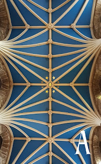
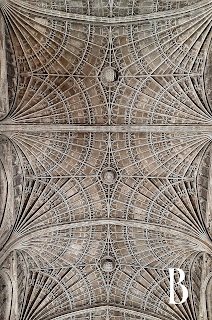
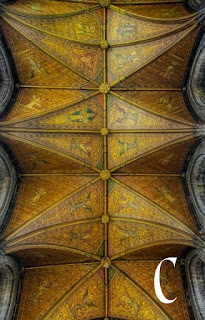
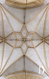
Apparently I can write, but when it comes to graphic design, I'm a bit challenged.
Decision-making regarding graphic design, even more so.
I use photographs of ceilings for my book covers, and within the next few months, I'll be combining Songbird, A Wider World and Lady, in Waiting into an e-book box set. (Not doing a paperback because it would cost a bomb and come in at over a thousand pages, and no one has the hands for that).
I don't have that requirement for the box set cover. It just needs to look period appropriate, which all these are, and work with the font used on the covers, which they will.
BUT I CAN'T DECIDE.
Which one is your favorite? Help a graphically-challenged author out. Please.


5 comments:
Use A. The blue is appealing, the design isn't too busy for your text.
I like A.
Same here: A. It has the best contrast and likely looks best when scaled down for a thumbnail image.
Yep. I concur. It's "A" all the way.
Well, that was nicely unanimous. Thank you!
Post a Comment